Why Does My POD Design Look Blurry?
Your POD design looks blurry because the file doesn’t contain enough pixels to fill the print area. That’s the short answer — and every other cause (wrong DPI setting, mockup weirdness, dark shirt behavior) traces back to pixel count.
Here’s how to diagnose what’s happening and fix it before your sample order arrives.
DPI Is Metadata. Pixel Count Is What Actually Matters.
DPI (dots per inch) tells a printer how many dots to squeeze into each inch of the physical print. But DPI is just a label embedded in the file — it’s not the same as image data. A 4,500 × 5,400 pixel image at 72 DPI and the same image at 300 DPI contain exactly the same number of pixels. The DPI tag changes; the image data doesn’t.
What actually determines print sharpness is pixel count relative to print size. You need enough pixels to reach at least 150–300 DPI once stretched across the physical print area.
According to Printful’s help documentation, a standard t-shirt print area is 12″ × 16″. To hit 150 DPI at that size, you need 1,800 × 2,400 pixels minimum. To hit 300 DPI, you need 3,600 × 4,800 pixels. If your file has fewer pixels than that and you stretch it to fill the shirt, the printer interpolates — it guesses what the missing pixels should look like — and the result is blur.
Printify’s design guidelines note that image size “is the main factor determining the quality of your printed design.” Their product creator will display a low-resolution warning when your pixel count falls below the threshold for a given product’s print area.
The number to remember: Check your pixel dimensions, not just the DPI tag. A file that reads “300 DPI” in Photoshop but is only 800 × 600 pixels will still print blurry.
Check your file before you upload: Our free DPI Checker shows you exactly whether your design meets Printify’s resolution requirements — before you waste a sample order. Check DPI Free →
How Much Resolution Do Different Products Actually Need?
Resolution requirements vary by product because print size varies. A mug wraps around a 9″ × 3.5″ surface; a poster might be 18″ × 24″. Here’s what Printful and Printify document for their most common product types:
| Product | Print Area | Min Pixels (150 DPI) | Rec. Pixels (300 DPI) |
|---|---|---|---|
| T-shirt (standard) | 12″ × 16″ | 1,800 × 2,400 | 3,600 × 4,800 |
| T-shirt (large format DTG) | 15″ × 18″ | 2,250 × 2,700 | 4,500 × 5,400 |
| Mug (11 oz) | 9″ × 3.5″ | 1,350 × 525 | 2,700 × 1,050 |
| Poster / wall art | 18″ × 24″ | 2,700 × 3,600 | 5,400 × 7,200 |
Printful explicitly recommends 150 DPI as the sweet spot for most apparel. For smaller, detail-heavy products like mugs and phone cases, they recommend 300 DPI because fine detail is viewed at close range and the print area is compact.
For large-format products — blankets, tapestries, leggings — Printify documents that 120–150 DPI is acceptable because customers view them from further away.
The practical rule: design at the final physical print size, at 300 DPI, from the start. Don’t design small and scale up later.
Upscaling a Low-Res File Doesn’t Fix It
This is the most common mistake POD sellers make when they get a blurry result: they open the file in Photoshop, change the DPI to 300, and re-upload. Nothing improves.
Changing the DPI tag without adding pixels just tells the printer to squeeze the same number of dots into a smaller area. The image data hasn’t changed. You’ve made the printed size smaller, not the quality better.
True upscaling — where software adds new pixels — doesn’t fix blur either, because the software is guessing. It uses algorithms (bilinear, bicubic, or AI-assisted interpolation) to estimate what the missing pixel data should look like. As Printful’s print file guide explains with a direct example: taking a 335 × 410 pixel image and enlarging it to fill a 12″ × 16″ shirt drops the effective DPI to about 60 — well below threshold — and the result looks stretched and soft regardless of what you do afterward.
The only reliable fixes:
- Recreate the design at full size at 300 DPI from the start (best option)
- Use a vector file (SVG or AI) that scales without any pixel limit
- Use an AI upscaling tool like Topaz Gigapixel or Real-ESRGAN, which are specifically trained to reconstruct edge detail — though results vary and a source image with very little detail won’t recover well
- Reduce the design size on the product — a smaller, sharp design beats a large blurry one
Printful’s own Smart Image Tool uses AI enhancement for files between 38–74 DPI, doubling DPI through trained reconstruction. It’s useful for marginal cases, but it can’t manufacture detail that was never captured in the original.
The Mockup Preview Isn’t Your Print File
A lot of blurry design panic comes from this: the product mockup in Printify’s creator looks soft, so you assume the print will too.
It usually won’t.
Printify’s mockup generator renders compressed preview images in the interface for faster loading. According to documentation from mockupify.io, “Printify uses your original design file for printing, not the mockup.” If you uploaded a high-resolution file, the print goes to production from that file — not from the downsampled mockup thumbnail you’re looking at on screen.
The same applies to Printful. Their interface renders mockups at screen resolution. A design that looks slightly soft in the browser preview may print sharply from the full-resolution source file.
How to verify: download your mockup image and open it at 100% zoom in an image viewer. If it’s sharp at full size, your print will likely be fine. If it’s blurry at 100% zoom, your source file has a resolution problem.
One real scenario where mockup blur does predict print blur: when your design is too small and Printify’s editor stretches it to fill the product placement. In that case, the upscaling you see in the mockup is the same upscaling that will happen to your print file.
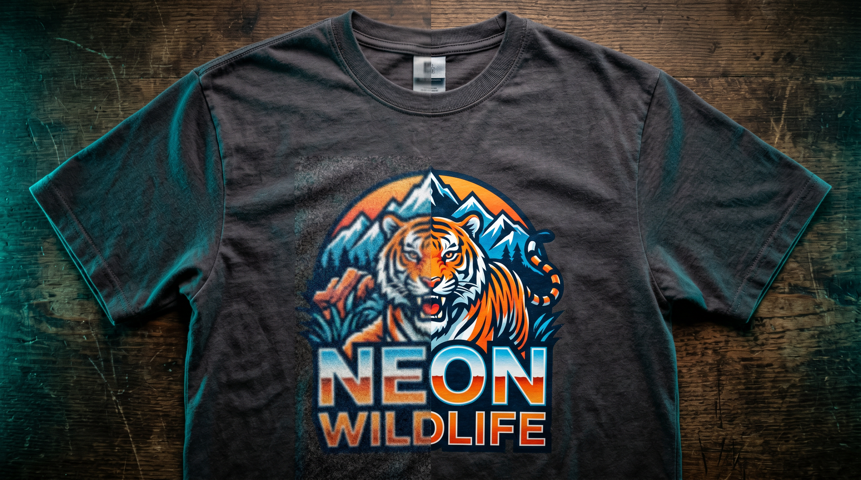
Dark Apparel and the Underbase Problem
Designs on dark shirts often look different — softer, less saturated, or slightly faded — compared to the mockup or how they’d appear on white fabric. This isn’t a resolution issue. It’s a printing technique issue.
DTG printing on dark garments requires a white underbase: a layer of white ink printed first, underneath your design, so colors read correctly against the dark fabric. Without it, the dark fabric absorbs the color ink and everything looks dull.
The underbase creates two predictable side effects:
1. Semi-transparent areas look wrong. Gradients and drop shadows that fade to transparent don’t blend into the shirt — they blend into white underbase. This creates a hard edge or white haze instead of a smooth fade. Printful’s DTG guidance recommends either 0% or 100% transparency on dark garments, or using halftone effects to simulate transparency without actual alpha.
2. Colors appear more muted than on light shirts. The white underbase layer sits between the ink and the fabric, which affects how light reflects off the garment. Highly saturated neon colors will appear dimmer on dark shirts than the same design on white.
If your design looks sharp but colors seem off on dark apparel, the underbase is almost certainly the reason — not your file resolution.
Fix the Blur Before You Order
A wasted sample order costs time and money. The fastest way to catch resolution problems is to check your pixel dimensions against the product’s print area before you upload — not after the shirt arrives at your door.
If your file passes the resolution check and you still have questions about getting print-ready artwork, Creative Fabrica’s design library has thousands of high-resolution, print-ready files sized correctly for POD products.
Browse Print-Ready Assets Free →
FAQ
Why does my design look blurry on Printify when it looks fine on my screen?
Screens display at 72–96 PPI and resize images dynamically to fit. A file that looks fine on a monitor may not have enough pixels to fill a 12″ × 16″ print at 150–300 DPI. Check your pixel dimensions — not just how it appears in your browser or design software.
Will Printify warn me if my resolution is too low?
Yes. Printify’s product creator shows a low-resolution warning when your image falls below the threshold for the selected print area. However, the warning doesn’t always appear for marginally low-resolution files, so checking pixel dimensions manually is still worth doing.
My mockup looks blurry. Will the actual print look blurry too?
Not necessarily. Printify renders compressed preview images in the interface for faster loading. The actual print is produced from your original uploaded file. Download the mockup and view it at 100% zoom to check. If the blur is only in the on-screen interface preview, your print will likely be fine. If the blur appears at full size, your source file needs more pixels.
Why does my design look faded or different on a black shirt vs a white one?
DTG printing on dark garments requires a white underbase layer under your design. The underbase affects how colors appear and makes semi-transparent elements (gradients, shadows) show as white rather than transparent. This is a printing technique characteristic, not a file quality problem.
Can I just increase the DPI in Photoshop to fix my blurry design?
Only if you also add pixels. Changing the DPI value in Photoshop’s image size panel (with “Resample” unchecked) just rescales the print size — it doesn’t add image data. To actually add pixels through resampling, you need to use “Resample” with a method like “Preserve Details 2.0” or use a dedicated AI upscaling tool. Even then, upscaling works best when the original file has moderate resolution; very low-resolution files won’t recover well.
What file format gives the best print quality for POD?
PNG is the safest choice for raster files — it’s lossless, supports transparency, and doesn’t introduce compression artifacts the way JPEG does. Printify specifically recommends PNG with no interlacing. For logos and text-based designs, SVG vector files are better because they scale infinitely with zero pixel limit.